Button table
The Button Table widget is responsible for rendering a table of vertically arranged HTML buttons.
This widget renders data supplied by the following components:
The following figure shows how a button table widget appears on
a transformation, using the data from the Function key component example as input:
Figure 1. Button table widget
example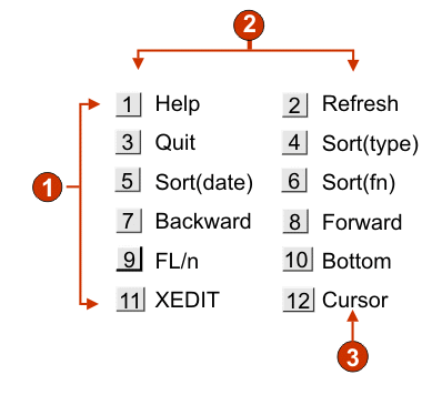
- Rows
- Number of columns per row (2)
- Caption
The following settings can be configured for this widget:
- Number of columns per row
- The number of buttons to display horizontally before wrapping
to the next line.
Note:
- This setting is not applicable in default rendering.
- The widget preview does not always match the full page preview. This happens because the widget preview simple renders the component's output. It does not try to preserve the alignment of the screen when it renders, as is done in the full page preview.
- Button style class (Web-only)
- Optional. The CSS style class associated with each generated button. The value of the class attribute of the HTML button tag will be set to this value. The default value is HATSBUTTON. See Using style sheets for more information.
- Caption style class (Web-only)
- Optional. The CSS style class associated with each item description (to the right of the generated button). The default value is HATSCAPTION. See Using style sheets for more information.
- Table style class (Web-only)
- Optional. The CSS style class associated with the generated table. The value of the class attribute of the HTML table tag will be set to this value. The default is HATSTABLE. See Using style sheets for more information.
- Style (Web-only)
- Optional. Any CSS properties that you want to override. For example, you can specify font-color: red; font-size: 18pt; in this field to change the font color and size for this widget. The properties you enter apply to each element of this widget. Use the launcher button next to this field to open a style properties dialog. This dialog frees you from the need to understand CSS to change the font, color, or other style settings for the widget. See Using style sheets for more information.