Button
The Button widget is responsible for rendering HTML buttons. Clicking one of these buttons will generally cause a host-specific action to occur (for example, an aid key will be sent to the host or an input field will be updated).
This widget renders data supplied by the following components:
The following figure shows how a button widget appears on a transformation,
using the data from the Function key component
example as input:
Figure 1. Button widget example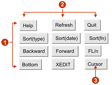
- Rows
- Columns (3 per row)
- Caption type (show description)
The following settings can be configured for this widget:
- Caption type
- Specifies how the caption for each button is determined. The value of the leading token and the description are derived from the component; you can select what appears on the button caption. For example, if the host screen had a menu item that read 4. Mail, you can have the caption display 4, or Mail, or 4. Mail.
- Trim spaces on caption
- If selected, white space (extra space) is trimmed from both ends of the caption.
- Layout
- Specifies how the buttons will be arranged on the HTML page.
Options: Table, Separated.
Note:
- This setting is not applicable in default rendering.
- The widget preview does not always match the full page preview. This happens because the widget preview simple renders the component's output. It does not try to preserve the alignment of the screen when it renders, as is done in the full page preview.
- Number of columns per row
- The number of buttons to display horizontally before wrapping to the next line. Tweaking this setting can cause your buttons to appear vertically (if this value is 1) or horizontally (if this value is equal to or greater than the number of buttons to be rendered).
- Separator
- Specifies what separator you want to use to separate the rendered buttons on the HTML page. You can select from the drop-down list or type in your own in the entry field.
- Enable foreground colors (Web-only)
- If selected, the button text is rendered using the color extracted
from the host screen by the component (only applicable when the function
key component is used).
Color information is extracted for the first host field containing any part of the function key. If the function key is split over two fields, such as F12= and Exit, the color information for the field containing F12= is extracted.
- Button style class (Web-only)
- Optional. The CSS style class associated with each generated button. The value of the class attribute of the HTML button tag will be set to this value. The default value is HATSBUTTON. See Using style sheets for more information.
- Style (Web-only)
- Optional. Any CSS properties that you want to override. For example, you can specify font-color: red; font-size: 18pt; in this field to change the font color and size for this widget. The properties you enter apply to each element of this widget. Use the launcher button next to this field to open a style properties dialog. This dialog frees you from the need to understand CSS to change the font, color, or other style settings for the widget. See Using style sheets for more information.