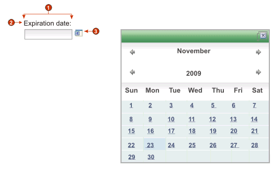
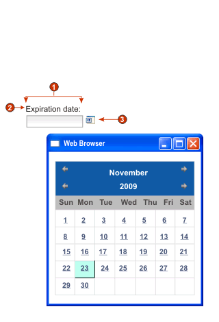
Calendar (Web-only)
- If you are testing your project using the Web browser built in to the Eclipse, using the WebSphere® Test Environment, you may see the calendar widget come up in a browser window bigger than expected and with additional unneeded controls. This will not happen when the application is run in an external browser, or when you run a deployed application.
- To display the pop-up calendar and image launcher when the ZIETrans application is accessed through a proxy server, you must configure the ZIETrans application to use the proxy server. For instructions see Configuring ZIETrans applications to use a proxy server.
- For DBCS considerations when using this widget see SBCS eliminate maximum length.
- Number of columns per row (1)
- Caption (from component)
- Launcher type (image)
Note: The examples have no captions for the launchers because the launchers are images. If the launchers are buttons or links, the launcher captions are shown on the buttons or in the links.
- Pattern
-
Required. When the user selects a date from the calendar widget, the selected date must be formatted to map correctly to what is expected in the host application's input field. This setting specifies the pattern ZIETrans uses to correctly format the selected date.
When you enter a pattern and save it, the ZIETrans Toolkit performs the following conversions to ensure correct symbols are used:- Uppercase D to lowercase d
- Uppercase Y to lowercase y
- Lowercase m to uppercase M
- Lowercase e to uppercase E
Note: The ZIETrans Toolkit always displays the pattern in uppercase characters. To see the actual case of the pattern symbols, see the pattern setting for the com.ibm.hats.transform.widgets.CalendarWidget class in the source of the application.hap file.You can spread the selected date over multiple consecutive host input fields by separating pattern elements with a tilde (~). For example, suppose you have the following input fields on your host screen:
Month: [ ] Day: [ ] Year: [ ]
If you specify a pattern of MM~DD~YYYY, a single launcher will be created. Once your user has selected a date, it will be spread over your three input fields: the 2-digit month will be placed in the first input field, the 2-digit day will be placed in the second input field, and the 4-digit year will be placed in the third input field.
Note: Click the Build button to use an aid to specify a pattern that spans multiple host input fields.
- Pattern locale
- Specifies the locale of the pattern. This setting is useful
if you have entered a pattern segment which should output a day name
(example: Wednesday). Options: Use
server locale, Use browser
locale, or Use specified
locale.
- Locale
- If you specify Use specified locale, select the locale for which to format the date specified by the user.
- Restrict earliest selectable date
- If selected, the value specified will be the earliest
date a user can select from the pop-up calendar.
Note:
- The date pattern is MM/DD/YYYY for all locales.
- A user is not prevented from manually entering an earlier date directly into the associated input field because of this setting.
- Restrict latest selectable date
- If selected, the value specified will be the latest
date a user can select from the pop-up calendar.
Note:
- The date pattern is MM/DD/YYYY for all locales.
- A user is not prevented from manually entering a later date directly into the associated input field because of this setting.
- Default value
- Optional. This field represents the initial date
selected on the pop-up calendar when the host application does not
pre-fill the associated input field with a valid date between the
specified restricted dates. It is also used when the user enters an
incorrect date (including a date out of range) before selecting the
pop-up calendar control. The interaction between this field and the
associated host input field is handled as follows:
- If the host application pre-fills the input field with zeros or an incorrect date format, the default value does not overwrite the host field data. To update the associated input field, the user must either manually enter a date, or select a date with the pop-up calendar.
- If the default value is not specified or is in an incorrect format, today's date will be initially selected on the pop-up calendar.
- If you want to pre-fill the associated input field, add an Insert Data action to your screen customization event before applying the transformation.
Note: The date pattern is MM/DD/YYYY for all locales.
- Caption source
- Specifies how the caption for the generated input field is determined.
Options: From component (use
the extracted caption from the component) or Custom (use the specified caption).
- Custom caption
- Optional. Specifies the caption for the input field.
Note: Leave this setting blank to not generate a caption for the input field.
- Number of columns per row
- Specifies how many instances of this widget should appear in
each row in the rendered Web page.Note:
- This setting is not applicable in default rendering.
- The widget preview does not always match the full page preview. This happens because the widget preview simply renders the component's output. It does not try to preserve the alignment of the screen when it renders, as is done in the full page preview.
- Launcher type
- Specifies the style of the launcher. The launcher is used to
open the calendar date picker. Options Button, Link, or Image.
- Caption
- The caption of the launcher button or link.
- Button style class
- Optional. The CSS style class associated with the generated launcher button. The value of the class attribute of the HTML button tag will be set to this value. The default value is HATSBUTTON . See Using style sheets for more information.
- Link style class
- Optional. The CSS style class associated with the generated launcher link. The value of the class attribute of the HTML link tag will be set to this value. The default value is HATSLINK. See Using style sheets for more information.
Note: Depending on the Web browser, there may be limitations to using the Tab key to tab to this launcher if either the Link or Image style is selected.
- Use inline calendar
- If selected, when the calendar date picker is launched, it is
displayed in the current Web page. If cleared, the date picker is
displayed in a new browser window. The default for newly created projects
is selected.
Note:
- Using the inline calendar date picker is helpful in cases where pop-up blockers prevent the display of the date picker in a new browser window.
- Use of the inline calendar date picker is not supported for ZIETrans applications for mobile devices.
- Read only
- If selected, rendered input fields are read only. A read only input field appears as a regular input field, but does not allow the user to modify its contents. This is useful in cases where you want to display the contents of a non-protected field to a user, but you do not want the user to modify the contents.
- Strip underscores on input field
- Select this box if you want to strip the underscores from text when it is rendered.
- Trim spaces on input field
- Selecting this trims leading and trailing spaces from the input field.
- Enable foreground colors
- If selected, host screen foreground colors are rendered.
Colors are mapped to CSS stylesheet classes representing that color. For example, if a host screen field is marked as RED, the Field widget will enclose the generated HTML for that field in a tag whose class name attribute is set to HRED. This allows for you to remap host screen colors on your generated Web page.Note: The blacktheme.css directly maps host screen field foreground colors (for example, red text on the host screen will appear as red text on the generated Web page). However, other stylesheet files like monochrome.css, map field colors differently in an attempt to create a consistent, modern style.
- Enable extended attributes
- If selected, extended field attributes (blink, reverse video,
underline, and column separator) are rendered. Also, for 3270 Web
applications, extended field colors are mapped (see the Enable foreground colors setting for more
information). See Using style sheets for more information.
- Blink style
- The CSS style setting you want to use to render blinking text from the host screen.
- Reverse video style
- The CSS style setting you want to use to render reverse video text from the host screen.
- Underline style
- The CSS style setting you want to use to render underlined text from the host screen.
- Column separator style
- The CSS style setting you want to use to render column separators from the host screen.
- Input field style class
- Optional. The CSS style class associated with the generated input field. The value of the class attribute of the HTML input tag will be set to this value. The default value is HATSINPUT. See Using style sheets for more information.
- Caption style class
- Optional. The CSS style class associated with the generated input field's caption. The default value is HATSCAPTION. See Using style sheets for more information.
- Table style class
- Optional. The CSS style class associated with the generated table. If more than one set of input fields is rendered, an HTML table will be generated to enclose these input fields. The value of the class attribute of the HTML table tag will be set to this value. The default value is HATSTABLE. See Using style sheets for more information.
- Style
- Optional. Any CSS properties that you want to override. For example, you can specify font-color: red; font-size: 18pt; in this field to change the font color and size for this widget. The properties you enter apply to each element of this widget. Use the launcher button next to this field to open a style properties dialog. This dialog frees you from the need to understand CSS to change the font, color, or other style settings for the widget. See Using style sheets for more information.