Dialog
The Dialog widget is responsible for rendering dialog boxes. It renders data supplied by the Dialog component.
The following figure shows how a Dialog widget appears
on a transformation using the data from the Dialog component example
as input:
Figure 1. Dialog widget example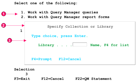
- Disabled area
- Specialized border
- Border characters removed
The following settings can be configured for this widget:
- Hide disabled area outside dialog
- Specifies whether to hide the area outside of the dialog.
- Disabled area style class (Web-only)
- Specifies the CSS style class to use for the disabled area.
- Use specialized borders (Web-only)
- Specifies whether to use specialized borders instead of the original text.
- Remove border characters (Web-only)
- Specifies whether to show the original border characters.
- Border style class
- Specifies the CSS style class to use for the border.
- Border style (Web-only)
- Left
- Specifies the CSS style class to use for the left border.
- Right
- Specifies the CSS style class to use for the right border.
- Top
- Specifies the CSS style class to use for the top border.
- Bottom
- Specifies the CSS style class to use for the bottom border.
- Corner style (Web-only)
- Top left
- Specifies the CSS style class to use for the top left border corner.
- Top right
- Specifies the CSS style class to use for the top right border corner.
- Bottom left
- Specifies the CSS style class to use for the bottom left border corner.
- Bottom right
- Specifies the CSS style class to use for the bottom right border corner.