Field
The Field widget is responsible for rendering input fields and text recognized by the Field component.
- Protected text
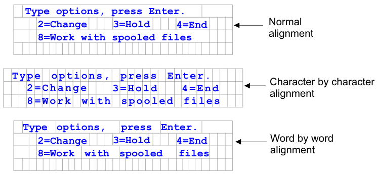
The primary goal of the table layout of the Field widget is to preserve the layout of the original host screen when it is rendered in a GUI. In default rendering, a table is used to preserve the layout of the screen. This table typically has 80 columns and 24 rows. Each of the different alignment settings in the Field widget (Normal, Character by character (Web-only), and Word by word) change how the table cells in this table are created.
With normal alignment, each host field is represented by a table cell within the table. The cell may consume one or more columns. See the "colspan" HTML attribute for more details. If a field starts at column 10 on the host screen, it will be positioned at column 10 in the table. Normal alignment guarantees that each field begins at the correct column location.
Global rules can impact the alignment of a page because typically a global rule consumes more page space than the field it has transformed. For example, imagine you have an input field that is five characters in length. Default rendering allocates five columns in the table for this field. If the field is rendered by a global rule that takes up more than five characters of space, the table cell it resides in is forced to expand, that is, the cell's width is increased. This impacts the entire table because the entire column is affected. Typically cells to the right of the field, in any row, are shifted to the right since the columns containing the transformed field are now wider. Therefore, a field starting at column 60 of row 5 will always be aligned with a field starting at column 60 of row 20.
Character by character alignment is supported only in ZIETrans Web projects. This alignment option causes each character of a field, except for input fields, to be rendered in its own table cell. Although using this option guarantees that every character on the screen is located at the correct starting location, it also causes the size of the generated page to be very large.
Word by word alignment causes each word on the screen to be rendered in its own table cell. This means that a single field made up of multiple words will be rendered in more than one table cell. This guarantees that every word on the screen is rendered at the correct location. This option is typically used when a host screen has a mix of input fields scattered throughout the screen. Input fields can cause a page to become misaligned since input fields consume more page space than regular text.
The following example shows how the different alignment options map fields and characters into table cells in default rendering. The table cells are invisible in actual default rendering.
- Read only
- If selected, input fields are not rendered. If an input field contains text (and is not password protected), the text is displayed instead. This setting is useful if you want to show users a page of information, but you do not want them editing it.
- Layout
-
Use this setting to specify the layout of the output rendered by this widget. Select Table to render the output in a table, with the goal of preserving the layout of the original host screen. This is the default for Web applications not optimized for mobile devices. Select Separated to render the output using inline span tags to differentiate between fields, with the goal of reducing the amount of HTML and blank space. This is the default for Web applications optimized for mobile devices.
- Alignment
- When using table layout, indicate how you want ZIETrans to map text characters into table cells in order to improve their alignment (Normal, Character by character (Web-only), or Word by word)
- Table style class (Web-only)
- Optional. The CSS style class associated with the generated table. The value of the class attribute of the HTML table tag will be set to this value. The default value is HATSFIELDTABLE. See Using style sheets for more information.
- nowrap (Web-only)
When you specify Word by word for the Alignment setting, multiple fields are aligned word by word in the transformation. However, another widget could create output that causes cells in the default rendering table to compress, thereby causing the text to wrap. To ensure that the text does not wrap, a nowrap flag is automatically added to the HTML output when word by word alignment is used. Use this nowrap setting to turn off the automatic addition of the nowrap flag to the HTML output.
Setting nowrap to false, with any value of the alignment settings, prevents the addition of the nowrap flag to the HTML output of the field widget, enabling the text in the cell to wrap. You should only set nowrap to false when you are using word by word alignment and continue to have alignment problems.
In default rendering, if a table cell wraps, both vertical and horizontal alignment can be adversely affected, causing undesirable output.
If you set nowrap to true with any value of the alignment setting, wrapping of text to the next line within a table cell does not occur.
Note: The nowrap setting does not appear in the GUI as a configurable setting. It must be set in the source of the application.hap file. For example, to set nowrap to false, on the ZIETrans Projects view double-click the Project Settings file in the project folder to launch the editor for the application.hap file. On the Source tab locate the class, name="com.ibm.hats.transform.widgets.FieldWidget", in the <classSettings> tag and add the following setting:<setting name="nowrap" value="false"/>
- Allow cursor positioning on protected fields
- If selected, clicking one of these protected fields causes the
host cursor to be set to that specific position. This setting is useful
if your host application is cursor position-sensitive and needs for
your user to position the cursor on a protected field.
For Web applications, how precisely the cursor position can be set is determined by the Alignment setting (Normal, Character by character (Web-only), or Word by word).
At runtime in the browser, ZIETrans is notified when one of these fields is clicked. ZIETrans updates the cursor position internally and then visually indicates the new cursor position to the user. By default, the visual indication is to set the background color of the text to yellow. For Web applications, this visual indication can be controlled by the developer using the CSS style, HCURSORINDICATOR. See Using style sheets for more information. With this setting enabled, the following capability is provided:- Allows you to position the cursor by clicking on an area of a protected field.
- Allows you to see the cursor's initial position when the page loads, even if the cursor is not inside an unprotected field.
Note: This setting alone will not work correctly when the same area of a screen is rendered multiple times using the Field widget. For example, in the case where the same region of the screen is rendered on multiple tabs in a tabbed folder, you must in addition render the protected fields as links (see Allow tabbing using links below) in order to provide your users with the ability to position the cursor on that region of the screen.- Allow tabbing using links (Web-only)
- If selected, each protected field is rendered as an HTML link
which allows tabbing between protected fields. The cursor position
will display as an underlined character.
Note: Selecting this option causes an HTML anchor <A> tag to be generated for each protected field on the page and as a result increases the size of the Web page.
To avoid unnecessarily increasing the size of the resulting Web page, this option is not selected by default.
- Link style class (Web-only)
- The CSS style class associated with each generated link. The value of the class attribute of the HTML link tag will be set to this value. The default value is HATSPROTLINK. See Using style sheets for more information.
- Action key
- Optional. Specifies the host AID key mnemonic that should be sent to the host when a protected field is selected. For example: [enter] , which causes the cursor to be set to the specified location and for enter to be sent, or [pf1] , which causes the cursor to be set to the specified location and for pf1 to be sent.
- Trim spaces on links
- If selected, white space (extra space) is trimmed from both ends of the protected field links. This setting is useful for reducing the amount of text that is rendered as links.
- Enable cursor positioning option on input fields (Web-only)
- Select this box to allow the user to switch from data input mode to cursor positioning mode for input fields. When in data input mode, the user can enter data into the input field. When in cursor positioning mode, the user can tab to or otherwise position the cursor on any character in the input field. This setting is useful for Web projects that are optimized for mobile devices that do not have other cursor positioning capabilities. For more information about other settings for this option that do not appear in the ZIETrans Toolkit GUI, see Considerations and limitations for mobile devices for more information.
- Enable foreground colors
- If selected, host screen foreground colors are rendered.
For Web applications, colors are mapped to CSS stylesheet classes representing that color. For example, if a host screen field is marked as RED, the Field widget will enclose the generated HTML for that field in a tag whose class name attribute is set to HRED. This allows for you to remap host screen colors on your generated Web page.Note: The blacktheme.css directly maps host screen field foreground colors (for example, red text on the host screen will appear as red text on the generated Web page). However, other stylesheet files like monochrome.css, map field colors differently in an attempt to create a consistent, modern style.
- Field style class (Web-only)
- Optional. The CSS style class associated with the generated field. The value of the class attribute of the HTML tag will be set to this value. The default value is HATSFIELD. See Using style sheets for more information.
- Enable extended attributes
- If selected, extended field attributes (blink (Web-only), reverse
video, underline, and column separator) are rendered. Also, for 3270
Web applications, extended field colors are mapped (see the Enable foreground colors setting for more
information).
- Blink style (Web-only)
- The CSS style setting you want to use to render blinking text from the host screen.
- Reverse video style (Web-only)
- The CSS style setting you want to use to render reverse video text from the host screen.
- Underline style (Web-only)
- The CSS style setting you want to use to render underlined text from the host screen.
- Column separator style (Web-only)
- The CSS style setting you want to use to render column separators from the host screen.
- Render using monospace font
- If selected, the field is rendered using a monospaced font. Otherwise, it is rendered using the default font for the locale environment.
- Enable 3270 numeric lock
- If selected, the user can enter only numbers 0 through 9, plus
sign, minus sign, period, comma, and Hindi numerals into
3270 numeric fields. If cleared, any characters can be entered. The
default is cleared.
Note: For Web applications, you can customize the list of acceptable keys in the lxgwfunctions.js file in the allowNumLockOnly() and allowNumLockOnlyForIEMobile() functions, as appropriate, using character code values.
- Strip underscores on input field
- Select this box if you want to strip the underscores from text when it is rendered.
- Trim spaces on input field
- Selecting this trims leading and trailing spaces from the input field.
- Style (Web-only)
- Optional. Use the launcher
button next to this field to open a style properties dialog. This
dialog frees you from the need to understand CSS to change the font,
color, or other style settings for the widget. See Using style sheets for
more information.
Note: Because of the large number of tags generated by this widget, you may considerably increase the download time of your page if you specify a value for this setting. Specify style overrides in the enclosing transformation or the included stylesheet file.