Item selection
The item selection component is responsible for recognizing screens with list of items, where the interaction is to select a character next to the item.
The item selection component can be rendered by the following widgets:
The following figure shows how an item selection component
might appear on your host screen:
Figure 1. Item selection component
example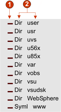
- Input field
- Caption
The following settings can be configured for this component:
- Extract field caption
- Select this box if you want available captions extracted for
the selected input fields.
- Strip end of caption
- Enabled only if Extract field caption is selected. Select this box to delete the ending text of a caption. Specify where to begin the deletion in Strip after, and any characters with which to replace the deleted caption text in Replace with.
- Trim spaces on caption
- Enabled only if Extract field caption is selected. Select this box to remove any extra spaces on either end of the captions.
- Captions are after input fields
- Enabled only if Extract field caption is selected. Select this box if the captions to be extracted are on the right of the input fields. Clear this box if captions are on the left of the input fields.
- Input fields must have a caption
- Select this box of you only want input fields with captions to be recognized on the host screen.
- Clip input field to selected region
- Select this box if you want to render only the selected part of an input field. Clear this box if you want to render the entire field if any part of the field is selected.