Scrollbar (ENPTUI)
The scrollbar (ENPTUI) widget renders data supplied from the Scrollbar field (ENPTUI) component.
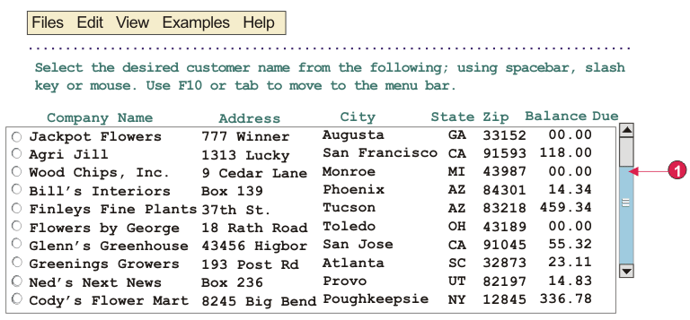
The following figure shows how a Scrollbar (ENPTUI) widget appears
on a transformation, using the data from the Scrollbar field (ENPTUI) component example as input:
Figure 1. Scrollbar (ENPTUI)
widget example

- Scrollbar
The following settings can be configured for this widget:
- Scrollbar style class (Web-only)
- Optional. The CSS style class associated with the scrollbar appearance. The default value is HATSESCROLL. See Using style sheets for more information.
- Scrollbar button style class (Web-only)
- Optional. The CSS style class associated with the scrollbar buttons. The default value is HATSESCROLLBUTTON. See Using style sheets for more information.
- Button arrow color (Web-only)
- The color of the button arrow. The default value is Black.
- Style (Web-only)
- Optional. Any CSS properties that you want to override. For example, you can specify font-color: red; font-size: 18pt; in this field to change the font color and size for this widget. The properties you enter apply to each element of this widget. Use the launcher button next to this field to open a style properties dialog. This dialog frees you from the need to understand CSS to change the font, color, or other style settings for the widget. See Using style sheets for more information.