Selection list
The Selection List component is responsible for recognizing selection
lists. Selection lists are like menus, but they are presented as a
list of options, each of which is preceded by a leading token and
a delimiter, such as in the following example:
In this example, Option is
the string before the leading token, 1, 2,
and 3 are the leading
tokens, and the delimiter is a period followed by a space (. ).
| Option 1. Prepare form |
| Option 2. Work with forms you submitted |
| Option 3. Work with forms requiring action |
Once a list item has been selected (either clicked or selected depending on the widget), its leading token is placed in the targeted host input field.
A recognized selection list can be rendered by the following widgets:
The following figure shows how a selection list component might
appear on your host screen:
Figure 1. Selection list component example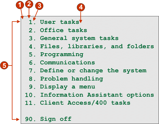
- String before the leading token (a space)
- Leading token type (digit)
- Delimiter (a period (.))
- End delimiter (a space)
- List options (or items)
The following settings can be configured for this component:
- String before the leading token
- Optional. The string which precedes the leading token of each list item.
- Leading token type
- Specifies whether each list item starts with letters, digits, or both letters and digits.
- Maximum length of leading token
- Specifies the maximum length of the leading token. The default is 4.
- Delimiter
- Required. The string of characters between the leading token and the description. You can specify more than one value, separated by the vertical bar (|) character.
- End delimiter
- Optional. The string of characters which must follow each list item.
- Minimum required options
- The minimum number of list items that must be found in order for the selected region to be recognized as a selection list.
- Group Items Individually
- Select this box if you want to group items individually.
- Selection target field
- Specifies which input field receives the selection. Options: First on screen, Last on screen, Previous field, Next field, Cursor position, or User defined.
- Row
- Specifies the row of the input field which should receive the
selection.
Note: This setting only applies if User defined is selected as the selection target.
- Column
- Specifies the column of the input field which should receive
the selection.
Note: This setting only applies if User defined is selected as the selection target.
- Auto submit on select
- If selected, an AID key is automatically sent to the host even if the input field is blank. If cleared, an AID key is not automatically sent.
- Action key
- Optional. Specifies the host aid key that should be pressed after the target input field has been updated with the user's selection. The default value is [enter] meaning that the enter key will be pressed once the user makes a selection.
- Sort list options
- If selected, list items are sorted according to either their
leading token or description (see below for more information about
other settings).
- Sort by
- Specifies whether to sort the set of list options by their leading token or description.
- Sort order
- Specifies whether to sort the set of list options in ascending
or descending order.
Note: The locale-sensitive sorting methods, built into Java™, are used to perform this operation.
- Placeholder options
- Specifies whether to embed placeholder list items when gaps (such as empty space) exist between list items. Options: Actual, None, or Single.