Table
The Table widget is responsible for rendering a GUI table.
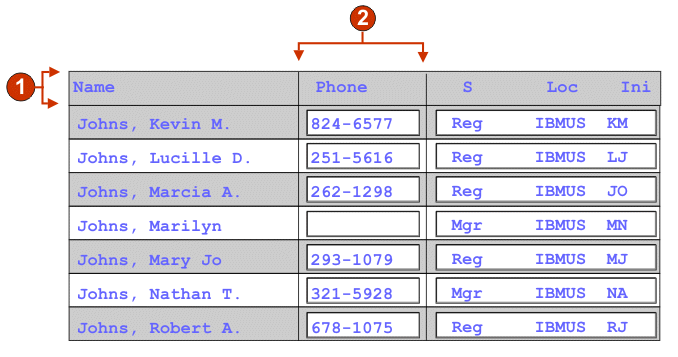
- Header row (1)
- Header column (not specified)
- Header row (Web-only)
- The comma-separated or ranged set of rows which should be rendered as a table header. This setting is useful for highlighting important rows in the generated table. The rows represented by this value are based on the recognized table, not on the actual host screen. Example values: 1,2,3...., 1,2-4, 3-5. See the description for Header row style class setting.
- Trim spaces on headers
- If selected, the text inside of cells of a header row is trimmed of whitespace (extra spaces) from both ends.
- Header column (Web-only)
- The comma-separated or ranged set of table columns which should be rendered as a header. This setting is useful for highlighting important columns (generally the first column) in the generated table. The columns represented by this value are based on the recognized table, not on the actual host screen. Example values: 1,2,3...., 1,2-4, 3-5. See the description for Header row style class setting.
- Disable input
- If selected, rendered input fields are read only. A read only input field appears as a regular input field, but does not allow the user to modify its contents. This is useful in cases where you want to display the contents of a non-protected field to a user, but you do not want the user to modify the contents.
- Columns placement (Web-only)
-
This widget can be configured to display primary columns of data, and optionally to have a details section to view additional detail columns. This setting is useful when displaying table data on a mobile device. For more information about these settings and about other settings for this option that do not appear in the ZIETrans Toolkit GUI, see Considerations and limitations for mobile devices.
- Primary columns
- Use this field to specify which columns to display, and in what
order. The field allows for numeric any-order listing of column numbers
with expansion shorthand, and columns are allowed to be displayed
more than once or not at all, for example, 1,3,2,5-7,2-3,9.
A hyphen (-) between two numbers indicates a range of columns. You can use the asterisk character (*) to indicate the last available column. An asterisk alone means columns 1 through n where n is the last available column. You can also use 5* as a shorthand for 5-*. These mean the same thing: 1-*, *.
For Web projects, this setting defaults to *, or all columns. For Web projects optimized for mobile devices, this setting defaults to 1-2, or columns 1 and 2.
Note: The numbers represent columns provided to the widget by the component. They do not represent the columns originally recognized by the component, which may or may not be excluded, before providing them to the widget. - Detail columns
- Use this optional field to specify which detail columns to display
when requested, and in what order. The field allows for numeric any-order
listing with expansion shorthand.
For Web projects, this setting defaults to empty, or no detail columns section. For Web projects optimized for mobile devices, this setting defaults to 3*, or column 3 through the last column.
- Keep detail columns on the server
- Select this option to keep the detail columns section on the server until requested by the user. This reduces the amount of HTML output at initial rendering. The default is cleared.
- Strip underscores on input field
- Select this box if you want to strip the underscores from text when it is rendered.
- Trim spaces on input field
- Select this box to trim leading and trailing spaces from the input field.
- Enable cursor positioning option on input fields (Web-only)
- Select this box to allow the user to switch from data input mode to cursor positioning mode for input fields. When in data input mode, the user can enter data into the input field. When in cursor positioning mode, the user can tab to or otherwise position the cursor on any character in the input field. This setting is useful for Web projects that are optimized for mobile devices that do not have other cursor positioning capabilities. For more information about other settings for this option that do not appear in the ZIETrans Toolkit GUI, see Considerations and limitations for mobile devices for more information.
- Enable foreground colors
- If selected, host screen foreground colors are rendered.
For Web applications, colors are mapped to CSS stylesheet classes representing that color. For example, if a host screen field is marked as RED, the Field widget will enclose the generated HTML for that field in a tag whose class name attribute is set to HRED. This allows for you to remap host screen colors on your generated Web page.Note: The blacktheme.css directly maps host screen field foreground colors (for example, red text on the host screen will appear as red text on the generated Web page). However, other stylesheet files like monochrome.css, map field colors differently in an attempt to create a consistent, modern style.
- Enable extended attributes
- If selected, extended field attributes (blink, reverse video,
underline, and column separator) are rendered. Also, for 3270 Web
applications, extended field colors are mapped (see the preceding
setting for more information). See Using style sheets for more
information.
- Blink style (Web-only)
- The CSS style setting you want to use to render blinking text from the host screen.
- Reverse video style (Web-only)
- The CSS style setting you want to use to render reverse video text from the host screen.
- Underline style (Web-only)
- The CSS style setting you want to use to render underlined text from the host screen.
- Column separator style (Web-only)
- The CSS style setting you want to use to render column separators from the host screen.
- Provide spreadsheet file
- If selected, a launcher is provided that will retrieve the
table data in spreadsheet file format.
- File name prefix
- Specifies a prefix for the spreadsheet file name. The default is spreadsheet. The complete file name will be in the form of FileNamePrefix_TimeStamp, where the timestamp format is MMDDYY_HHMMSS, for example, spreadsheet_041506_113020.
- File name extension
- The extension name for the type of spreadsheet format. Options are .csv and .xls. The .csv file are pure text files, with data columns separated by commas. The .xls files are Microsoft Excel Biff3 files. The default is .csv.
- Launcher type
- The type of launcher to display to the user. Options
are Link, Image,
and Button. The default is Link (Web projects).
- Launcher caption
- The caption for the launcher to display to the user. The default is Download (Web projects).
- Button style class (Web-only)
- The CSS style class associated with the generated launcher button. The value of the class attribute of the HTML button tag will be set to this value. The default value is HATSBUTTON. See Using style sheets for more information.
- Link style class (Web-only)
- Optional. The CSS style class associated with the generated launcher link. The value of the class attribute of the HTML link tag will be set to this value. The default value is HATSLINK. See Using style sheets for more information.
- Table style class (Web-only)
- Optional. The CSS style class associated with the generated table. The value of the class attribute of the HTML table tag will be set to this value. The default value is HATSTABLE. See Using style sheets for more information.
- Table cell style class (Web-only)
- Optional. The CSS style class associated with each cell in the generated table. The value of the class attribute of the HTML table cell (td) tag will be set to this value. The default value is HATSTABLECELL. See Using style sheets for more information.
- Header row style class (Web-only)
- Optional. The CSS style class associated with each header row or column in the generated table. The value of the class attribute of the HTML table row or cell tag will be set to this value. The default value is HATSTABLEHEADER. See Using style sheets for more information.
- Odd row style class (Web-only)
- Optional. The CSS style class associated with each odd numbered row in the table. The value of the class attribute of each HTML table row tag in an odd row number will be set to this value. The default value is HATSTABLEODDROW. See Using style sheets for more information.
- Even row style class (Web-only)
- Optional. The CSS style class associated with each even numbered row in the table. The value of the class attribute of each HTML table row tag in an even row number will be set to this value. The default value is HATSTABLEEVENROW. See Using style sheets for more information.
- Style (Web-only)
- Optional.Use the launcher button next to this field to open a style properties dialog. This dialog frees you from the need to understand CSS to change the font, color, or other style settings for the widget. See Using style sheets for more information.