Considerations and limitations for mobile devices
- There is not an automated option that allows you to convert a ZIETrans project that is not optimized for mobile devices to one that is optimized for mobile devices, or vice-versa.
- The option to specify a project theme is not provided. Instead, options are automatically initialized to work best for mobile devices.
- Only templates that are optimized for mobile devices are provided
for use in the project.
Note: If you do not want to have horizontal scrolling using the Modern template, add the overflow: auto; style to .roundedcornermodule in the Modern.jsp template file. For example, change .roundedcornermodule {margin: 0px;} to .roundedcornermodule { margin: 0px; overflow: auto; }. This forces the page to keep its original size and keep within the visual screen on the device. Note that in some cases this might result in data on the page being truncated, and therefore the design of customized pages and widget choices should take the screen size into account.
- A second rendering set, named compact, is created in the project. This rendering set is specified as the default rendering set. It also has the Use compact rendering option selected which reduces the amount of HTML and blank space in default rendering, which in turn may display a different structure of the original host screen.
- The ZIETrans preference, Include a Free Layout Table, that takes effect when you create a new blank transformation, has as additional modifier, Except when the project is optimized for mobile devices. This modifier is selected by default. Therefore, blank transformations added to your mobile project will not include a free layout table by default.
- Field Exit, Field+, and Field- can be used by using the Enable cursor positioning option on input fields option in combination with the Host Keypad or Host Key buttons.
- The Field widget provides a Separated layout option to render output using inline span tags, instead of using a table, to differentiate between fields. The goal of using this option is to reduce the amount of HTML and blank space. This is the default for mobile projects.
- ZIETrans provides Columns
placement support for subfile and table widgets. This is useful
when displaying table data on a mobile device by allowing the arrangement
and exclusion of columns from the display, as well as by allowing
expandable details sections so the table can fit into a smaller space.
The details section, when expanded, is displayed directly below the row containing the primary columns of data. Once a particular row of interest is identified by the user, the details of that row, when expanded, are displayed in a format that flows down the screen rather than to the right. This enables small displays to view the needed details of an arbitrary number of columns without resorting to horizontal scrolling.
The figures below show a subfile as displayed on a host screen, followed by the primary view of the subfile and a details view of the subfile using the default Columns placement support.Figure 1. Subfile on a host screen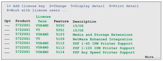 Figure 2. Primary view of the subfile using default Columns placement support
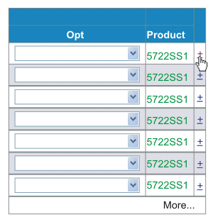 Figure 3. Details view of a subfile row using default Columns placement support
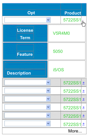
In addition to saving screen real estate, you can configure the widget to keep the detail columns on the server until requested rather than sending them using HTTP to the user’s browser. This allows for a reduction in some cases of the amount of data transferred because unwanted detail data is never sent over HTTP to the end device. Only the details that are specifically requested by the user are retrieved on-demand and sent to the browser.
Note: Subfiles configured to use the field component to recognize the data portion of the subfile cannot effectively use primary and detail column capability due to the fact that such subfiles cannot distinguish columns, but only rows.In addition to the Columns placement subfile and table widget settings described in Widget settings, the following settings can be used to further customize the appearance of the controls used for this option. These settings do not appear in the ZIETrans Toolkit GUI. Instead, you must add these settings to the source for the widget. The source below shows examples of these settings using a Subfile widget as an example.<class name="com.ibm.hats.transform.widgets.SubfileWidgetV6"> <setting name="normalColumnLayout" value="1,2"/> <setting name="extendedColumnLayout" value="3*"/> <setting name="keepExpansionOnServer" value="true"/> <setting name="expandHeaderValue" value="fred"/> <setting name="expandRepresentation" value="button"/> <setting name="expandValue" value="click me"/> <setting name="collapseRepresentation" value="image"/> <setting name="collapseValue" value="/common/images/twisty1.gif"/> <setting name="collapseAltValue" value="hide"/> </class>- expandRepresentation
- Determines the graphical representation used for the control that shows the details. Specify button, link, or image. The default is link.
- expandValue
- If expandRepresentation is either button or link, this value is used as text on the
button or link. If no value is supplied, a plus sign (+) is used by default. An empty string
value"" is not accepted and defaults to a plus sign (+).
If expandRepresentation is image, this value is the path to and the name of the image file to use. The path is searched relative to the Web Content directory of the project. For example, if you want to specify the twisty1.gif in the Web Content/common/images directory, you set expandValue as shown below:
<setting name="expandValue" value="/common/images/twisty1.gif "/> - expandAltValue
- This setting provides alternate text for the image. It is used only when expandRepresentation is set to image and the browser cannot display the specified image, for example, the Menu > View > Show Pictures option of Internet Explorer Mobile is not selected.
- collapseRepresentation
- Determines the graphical representation used for the control that hides the details. Specify button, link, or image. The default is link.
- collapseValue
- If collapseRepresentation is either button or link, this value is used as text on the
button or link. If no value is supplied, a minus sign (-) is used by default. An empty
string value"" is not accepted and defaults to a minus
sign (-).
If collapseRepresentation is image, this value is the path to and the name of the image file to use. The path is searched relative to the Web Content directory of the project. For example, if you want to specify the twisty1.gif in the Web Content/common/images directory, you set collapseValue as shown below:
<setting name="collapseValue" value="/common/images/twisty1.gif "/> - collapseAltValue
- This setting provides alternate text for the image. It is used only when collapseRepresentation is set to image and the browser cannot display the specified image, for example, the Menu > View > Show Pictures option of Internet Explorer Mobile is not selected.
- expandHeaderValue
- This setting provides the header text for the column for the details controls. A value specified as "" creates a header with no text.
- expandStyle, expandClass, expandHeaderStyle, expandHeaderClass, expandAreaStyle, expandAreaClass, expandRowStyle, expandRowClass, collapseStyle, collapseClass, collapseAreaStyle, collapseAreaClass
- These are class and style overrides for the controls for this option. If not specified, the standard values for widgets apply. Standard HTML styles can be used, and classes are applied in order.
- The setting, Enable cursor positioning
option on input fields, available for widgets used to render
input fields, provides users a method of switching from data input
mode to cursor positioning mode for input fields. When in data input
mode, the user can enter data into the input field. When in cursor
positioning mode, the user can tab to or otherwise position the cursor
on any character in the input field. This setting is useful for devices
that do not have other cursor positioning capabilities.
In addition to the Enable cursor positioning option on input fields widget settings described in Widget settings, the following settings can be used to further customize the appearance of the controls used for this option. These settings do not appear in the ZIETrans Toolkit GUI. Instead, you must add these setting to the source for the widget. The source below shows examples of these settings using a Field widget as an example.
<class name="com.ibm.hats.transform.widgets.FieldWidget"> <setting name="dataModeCEPRepresentation" value="button"/ <setting name="dataModeCEPValue" value="back"/> <setting name="dataModeCEPAltValue" value="data entry"/> <setting name="cursorModeCEPRepresentation" value="image"/> <setting name="cursorModeCEPValue" value="cursorOn.gif"/> <setting name="cursorModeCEPAltValue" value="cursor entry"/> <setting name="cursorCEPRepresentationStyle" value="text-underline:true"/> <setting name="useCursorExactPositioningOption" value="true"/> </class>- dataModeCEPRepresentation
- Determines the graphical representation used for the control shown next to the input field when in the data mode. Specify button, link, or image. The default is link.
- dataModeCEPValue
- If dataModeCEPRepresentation is either button or link, this value is used as text on the
button or link. If no value is supplied, an asterisk character (*) is used by default. An empty string
value"" is not accepted and defaults to an asterisk character
(*).
If dataModeCEPRepresentation is image, this value is the path to and the name of the image file to use. The path is searched relative to the Web Content directory of the project. For example, if you want to specify the sbarleftblk.gif in the Web Content/common/images directory, you set dataModeCEPValue as shown below:
<setting name="dataModeCEPValue" value="common/images/sbarleftblk.gif"/> - dataModeCEPAltValue
- This setting provides alternate text for the image. It is used only when dataModeCEPRepresentation is set to image and the browser cannot display the specified image, for example, the Menu > View > Show Pictures option of Internet Explorer Mobile is not selected.
- dataModeIconClass, dataModeIconStyle
- These are style and class overrides for the data mode representation icon. If not specified, the standard values for widgets apply. Standard HTML styles can be used, and classes are applied in order.
- cursorModeCEPRepresentation
- Determines the graphical representation used for the control shown next to the input field when in the cursor mode. Specify button, link, or image. The default is link.
- cursorModeCEPValue
- If cursorModeCEPRepresentation is either button or link, this value is used as text on the
button or link. If no value is supplied, an asterisk character (*) is used by default. An empty string
value"" is not accepted and defaults to an asterisk character
(*).
If cursorModeCEPRepresentation is image, this value is the path to and the name of the image file to use. The path is searched relative to the Web Content directory of the project. For example, if you want to specify the sbarrightblk.gif in the Web Content/common/images directory, you set cursorModeCEPValue as shown below:
<setting name="cursorModeCEPValue" value="common/images/sbarrightblk.gif "/> - cursorModeCEPAltValue
- This setting provides alternate text for the image. It is used only when cursorModeCEPRepresentation is set to image and the browser cannot display the specified image, for example, the Menu > View > Show Pictures option of Internet Explorer Mobile is not selected.
- cursorCEPRepresentationStyle
- This style is used to highlight the currently selected cursor position. The default is border-bottom: 1px solid green;. but an empty string "" is valid.
- cursorModeCEPStyle
- This is the style used around the input field while in cursor mode. The default style is border: 1px solid #999999; height: 1.75em;. It is not recommended to change this unless necessary.
- cursorCEPRepresentationClass, cursorModeIconClass, cursorModeIconStyle, cursorModeCEPClass, cursorModeCEPTextStyle, cursorModeCEPTextClass
- These are class and style overrides for decorating elements in the cursor mode area. If not specified, the standard values for widgets apply. Standard HTML styles can be used, and classes are applied in order.
- dataModeIconClass, dataModeIconStyle
- These are class and style overrides for decorating elements in the data mode area. If not specified, the standard values for widgets apply. Standard HTML styles can be used, and classes are applied in order.
- There are some instances during a wireless connection where
the connection to the router or HTTP server is lost. If this occurs,
the Web page may be locked, and ZIETrans cannot resend any information.
The following settings are available to resolve this issue. The settings
are available in the RuntimeSettings class in the Project Settings
source view (the application.hap file).
- usePageUID
- Specifies whether to enable a pageUID being put on the screen. This allows the runtime to track the page to see if it has already been sent. If this value is false, the pageSubmitTimeout value is not read. The default value is false.
- pageSubmitTimeout
- Specifies how long to wait, in milliseconds, before unlocking the Web page for use by the user. A value of -1, or empty, results in this function being inactive. The default value is -1.
- incorrectPageUIDEvent
- Specifies what to do when the PageUID on the user's Web page HTTP request does not match the PageUID that is stored in the runtime for that sessionid and application instance. It has 2 options: REFRESHCOMMAND or ERROREVENT. The default is REFRESHCOMMAND.
<class name="com.ibm.hats.common.RuntimeSettings"> <setting name="autoEraseFields" value="true"/> <setting name="enableAutoAdvance" value="false"/> <setting name="enableAutoTabOn" value="false"/> <setting name="enableBusyPage" value="false"/> <setting name="enableCompression" value="false"/> <setting name="enableOverwriteMode" value="false"/> <setting name="incorrectPageUIDEvent" value="REFRESHCOMMAND"/> <setting name="pageSubmitTimeout" value="1000"/> <setting name="selectAllOnFocus" value="false"/> <setting name="suppressUnchangedData" value="false"/> <setting name="usePageUID" value="true"/> </class> - AJAX polling from a browser running on an iPhone or iPod touch device stops when you switch from the browser to another application. As a result, when you switch from a browser accessing ZIETrans to another application on the device, ZIETrans disconnects the browser session after the Time to wait for disconnect (seconds) interval has passed. You may wish to increase this interval or disable the auto-disconnect function for ZIETrans applications accessed from iPhone or iPod touch devices. For more information see Using the client pull (AJAX) method.
- For DBCS considerations, see Working with mobile device applications.
- ZIETrans Web projects cannot be migrated or automatically converted into ZIETrans Web projects for mobile devices.
- Accessibility features.
- Any device with screen sizes smaller than 320x240.
- Keyboard host key support.
As a result, using a keyboard works as a normal Web keyboard, host keys are not sent, instead the F1 key brings up the browser help, and the Enter key is not mapped to the host Enter key.
Also, without keyboard support, the ZIETrans JavaScript cannot determine that the user has entered data on the ZIETrans Web page. As a result, auto-refresh support overwrites any data that the user has entered into the GUI view of the ZIETrans application if a new host screen is asynchronously received from the host application.
- Field specific help, right justify, capitalizes, or other attributes.
- Any other data entry limitations inherent to the device hardware or software.
- ZIETrans administrative console page access by a mobile device.
- The disconnectOnClose connection parameter.
- Screen combinations.
- Calendar widget with Windows Mobile.
- Tabbed folder support.
- Spreadsheet support.