Drop-down (selection)
The Drop-down (selection) widget is responsible for rendering HTML drop-down lists.
This widget renders data supplied by the following components:
The following figure shows how a selection list drop-down list
widget appears on a transformation, using the data from the Selection list component example as input:
Figure 1. Selection
list drop-down list widget example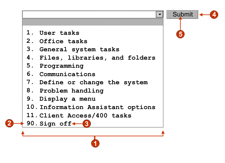
- Caption type (show both)
- Leading token (show both)
- Description (show both)
- Submit button (show submit button)
- Submit button caption (submit)
The following settings can be configured for this widget:
- Caption type
- Specifies how the leading token of the list item is displayed. The value of the leading token and the description are derived from the component; you can select what appears in the drop-down list. For example, if the host screen had a menu item that read 4. Mail, you can have the caption display 4, or Mail, or 4. Mail.
- Auto submit on select
- If selected, once a selection is made in the drop-down list, it is submitted. If the drop-down list contains function keys, the selected list item's key is sent to the host. If the drop-down list contains selection list items, the selected item's value is inserted into the target field and the specified action key is sent to the host.
- Show submit button
- If selected, a submit button is rendered
next to the drop-down list. Does not apply when
using this widget with the function key component.
- Submit button caption
- Optional. Specifies the caption of the submit button.
- Button style class (Web-only)
- Optional. The CSS style class associated with the generated submit button. The value of the class attribute of the HTML button tag will be set to this value. The default value is HATSBUTTON. See Using style sheets for more information.
- Drop-down style class (Web-only)
- Optional. The CSS style class associated with the generated drop-down list. The value of the class attribute of the HTML drop-down tag will be set to this value. The default value is HATSDROPDOWN. See Using style sheets for more information.
- List option style class (Web-only)
- Optional. The CSS style class associated with each option in the drop-down list. The default value is HATSOPTION. See Using style sheets for more information.
- Caption style class (Web-only)
- Optional. The CSS style class associated with the caption of the generated drop-down list. The default value is HATSCAPTION. See Using style sheets for more information.
- Table style class (Web-only)
- Optional. The CSS style class associated with the generated table. If more than one drop-down list is rendered, an HTML table will be generated to enclose these drop-down lists. The value of the class attribute of the HTML table tag will be set to this value. The default value is HATSTABLE. See Using style sheets for more information.
- Style (Web-only)
- Optional. Any CSS properties that you want to override. For example, you can specify font-color: red; font-size: 18pt; in this field to change the font color and size for this widget. The properties you enter apply to each element of this widget. Use the launcher button next to this field to open a style properties dialog. This dialog frees you from the need to understand CSS to change the font, color, or other style settings for the widget. See Using style sheets for more information.