Link
The Link widget is responsible for rendering HTML links.
This widget renders data supplied by the following components:
The following figure shows how a link widget appears on a transformation,
using the data from the Selection list component
example as input:
Figure 1. Link widget example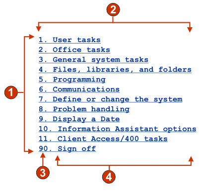
- Rows
- Number of columns per row (1)
- Leading token (show both)
- Description (show both)
The following settings can be configured for this widget:
- Caption type
- Specifies how the caption for each link is determined. The value of the leading token and the description are derived from the component; you can select what appears as the text for the link. For example, if the host screen had a menu item that read 4. Mail, you can have the text display 4, or Mail, or 4. Mail.
- Trim spaces on caption
- If selected, white space (extra space) is trimmed from both ends of the caption.
- Layout
- Specifies how the links will be arranged on the HTML page. Options: Table, Separated.
Note:
- This setting is not applicable in default rendering.
- The widget preview does not always match the full page preview. This happens because the widget preview simple renders the component's output. It does not try to preserve the alignment of the screen when it renders, as is done in the full page preview.
- Number of columns per row
- The number of links to display horizontally before wrapping to the next line.
- Separator
- Specifies what separator you want to use to separate the rendered links on the HTML page. You can select from the drop-down list or type in your own in the entry field.
- Target (Web-only)
- Select from the drop-down list the target where you want to display the contents of the linked URL; the same, new, parent, or top window.
- Link style class (Web-only)
- Optional. The CSS style class associated with each generated link. The value of the class attribute of the HTML link tag will be set to this value. The default value is HATSLINK. See Using style sheets for more information.
- Style (Web-only)
- Optional. Use the launcher button next to this field to open a style properties dialog. This dialog frees you from the need to understand CSS to change the font, color, or other style settings for the widget. See Using style sheets for more information.