Radio button (selection)
The Radio button (selection) widget is responsible for rendering a set of radio buttons.
This widget renders data supplied by the following components:
The following figure shows how a selection list radio button widget
appears on a transformation, using the data from the Selection list component example as input:
Figure 1. Selection
list radio button widget example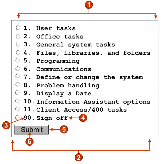
- Caption type (show both)
- Number of columns per row (1)
- Leading token (show both)
- Description (show both)
- Submit button (show submit button)
- Submit button caption (submit)
The following settings can be configured for this widget:
- Caption type
- Specifies how the caption for each button is determined. The value of the leading token and the description are derived from the component; you can select what appears on the button caption. For example, if the host screen had a menu item that read 4. Mail, you can have the caption display 4, or Mail, or 4. Mail.
- Trim spaces on caption
- If selected, white space (extra space) is trimmed from both ends of the caption.
- Number of columns per row
- The number of radio buttons to display horizontally before wrapping to the next line.
- Auto submit on select
- If selected, once a radio button is selected, the selection is submitted. If the radio button was generated from a function key, the selected item's key is sent to the host. If the radio button was generated from a selection list, the selected item's value is inserted into the target field and the specified action key is sent to the host.
- Show submit button
- If selected, a submit button is rendered
below the set of radio buttons. Does not apply when using this widget
with the function key component.
- Submit button caption
- Optional. Specifies the caption of the submit button.
- Button style class (Web-only)
- Optional. The CSS style class associated with the generated submit button. The value of the class attribute of the HTML button tag will be set to this value. The default value is HATSBUTTON. See Using style sheets for more information.
- Radio button style class (Web-only)
- Optional. The CSS style class associated with each radio button. The default value is HATSRADIOBUTTON. See Using style sheets for more information.
- Radio button description style class (Web-only)
- Optional. The CSS style class associated with each radio button description. The default value is HATSTEXT. See Using style sheets for more information.
- Label style class (Web-only)
- Optional. The CSS style class associated with the generated caption for the set of radio buttons. The default value is HATSCAPTION. See Using style sheets for more information.
- Table style class (Web-only)
- Optional. The CSS style class associated with the generated table. If more than one radio button is rendered, an HTML table will be generated to enclose them. The value of the class attribute of the HTML table tag will be set to this value. The default value is HATSTABLE. See Using style sheets for more information.
- Style (Web-only)
- Optional.Use the launcher button next to this field to open a style properties dialog. This dialog frees you from the need to understand CSS to change the font, color, or other style settings for the widget. See Using style sheets for more information.