Text input
The Text input widget is responsible for rendering HTML input fields.
This widget renders data supplied by the following components:
Note: For DBCS considerations when using this widget see SBCS eliminate maximum length.
The following figure shows how a text input widget appears on a
transformation, using the data from the Command line component
example as input:
Figure 1. Text input widget example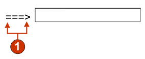
- Caption (from component)
The following settings can be configured for this widget:
- Override size
- If selected, the specified size value will be set on each generated input field. This setting is useful for
visually changing the size of a large host input field. If cleared,
the size of the input field is determined by the recognizing component.
- Size
- The size of each input field.
Note: This value is interpreted by the browser – no guarantee is made as to how an input field will be rendered on different browsers.
- Override maximum length
- If selected, the specified maximum length value will be set
on each generate input field. This setting is useful for manually
restricting the number of characters that can be entered into an input
field. If cleared, the maximum number of allowable characters is determined
by the recognizing component.
- Maximum length
- The maximum number of characters that can be entered into each input field.
- Add input attributes
- If selected, the specified attributes will be added on each
input field. This setting is useful for adding any extra attributes
which are useful for customization. If type attribute is specified,
the default type=text will be overridden by specified attribute. Same
way maxlength and size attributes also will be overridden by specified
attributes.
- Input attributes
- Any valid attribute value pair or a set of attribute value pairs separated by space. Any double quotes entered will be converted to single quotes. If any attribute value contains spaces, specify it with in single quotes
Note: The attribute value pair is interpreted by the browser - no guarantee is made as to how an input field will be rendered on different browsers. Example input attributes: type=date type=‘image’ alt=‘Click me!’ src=‘my-img.png’ width=’80’ height=’30’
- Caption source
- Specifies how the caption for the generated input field is determined.
Options: From component (use
the extracted caption from the component) or Custom (use the specified caption).
- Custom caption
- Optional. Specifies the caption for the input field.
Note: Leave this setting blank to not generate a caption for the check box.
- Number of columns per row
- The number of input fields to display horizontally before wrapping
to the next line.Note:
- This setting is not applicable in default rendering.
- The widget preview does not always match the full page preview. This happens because the widget preview simply renders the component's output. It does not try to preserve the alignment of the screen when it renders, as is done in the full page preview.
- Read only
- If selected, the rendered input field is read only. A read only input field appears as a regular input field, but does not allow the user to modify its contents. This is useful in cases where you want to display the contents of a non-protected field to a user, but you do not want the user to modify the contents.
- Strip underscores on input field
- Select this box if you want to strip the underscores from text when it is rendered.
- Trim spaces on input field
- Selecting this trims leading and trailing spaces from the input field.
- Enable cursor positioning option on input fields (Web-only)
- Select this box to allow the user to switch from data input mode to cursor positioning mode for input fields. When in data input mode, the user can enter data into the input field. When in cursor positioning mode, the user can tab to or otherwise position the cursor on any character in the input field. This setting is useful for Web projects that are optimized for mobile devices that do not have other cursor positioning capabilities. For more information about other settings for this option that do not appear in the ZIETrans Toolkit GUI, see Considerations and limitations for mobile devices for more information.
- Enable foreground colors
- If selected, host screen foreground colors are rendered.
For Web applications, colors are mapped to CSS stylesheet classes representing that color. For example, if a host screen field is marked as RED, the Field widget will enclose the generated HTML for that field in a tag whose class name attribute is set to HRED. This allows for you to remap host screen colors on your generated Web page.Note: The blacktheme.css directly maps host screen field foreground colors (for example, red text on the host screen will appear as red text on the generated Web page). However, other stylesheet files like monochrome.css, map field colors differently in an attempt to create a consistent, modern style.
- Enable 3270 numeric lock
- If selected, the user can enter only numbers 0 through 9, plus
sign, minus sign, period, comma, and Hindi numerals into
3270 numeric fields. If cleared, any characters can be entered. The
default is cleared.
Note: For Web applications, you can customize the list of acceptable keys in the lxgwfunctions.js file in the allowNumLockOnly() and allowNumLockOnlyForIEMobile() functions, as appropriate, using character code values.
- Enable extended attributes
- If selected, extended field attributes (blink, reverse video,
underline, and column separator) are rendered. Also, for 3270 Web
applications, extended field colors are mapped (see the preceding
setting for more information). See Using style sheets for more
information.
- Blink style (Web-only)
- The CSS style setting you want to use to render blinking text from the host screen.
- Reverse video style (Web-only)
- The CSS style setting you want to use to render reverse video text from the host screen.
- Underline style (Web-only)
- The CSS style setting you want to use to render underlined text from the host screen.
- Column separator style (Web-only)
- The CSS style setting you want to use to render column separators from the host screen.
- Input field style class (Web-only)
- Optional. The CSS style class associated with the generated input field. The value of the class attribute of the HTML input tag will be set to this value. The default value is HATSINPUT. See Using style sheets for more information.
- Caption style class (Web-only)
- Optional. The CSS style class associated with the generated input field's caption. The default value is HATSCAPTION. See Using style sheets for more information.
- Table style class (Web-only)
- Optional. The CSS style class associated with the generated table. If more than one input field is rendered, an HTML table will be generated to enclose these fields. The value of the class attribute of the HTML table tag will be set to this value. The default value is HATSTABLE. See Using style sheets for more information.
- Style (Web-only)
- Optional.Use the launcher button next to this field to open a style properties dialog. This dialog frees you from the need to understand CSS to change the font, color, or other style settings for the widget. See Using style sheets for more information.