Combo (RCP-only)
The Combo widget is responsible for rendering editable drop-down
combination boxes.
Note:
- For security reasons, the Combo widget should not be used to render password fields. Characters typed into a password field rendered with the Combo widget will be visible as the user types.
- For DBCS considerations when using this widget see AutoIME switching.
This widget renders data supplied by the following components:
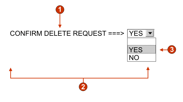
The following figure shows how a combo widget appears on a transformation,
using the data from the Input field with hints component
example as input:
Figure 1. Combo widget example

- Caption (from component)
- Number of columns per row (defaults to 1)
- Fill (from hints)
The following settings can be configured for this widget:
- Fill from global variable
- If selected, fill the drop-down from the specified global variables.
- Global variable containing list values
- Specifies the name of the indexed global variable containing the set of values. An item for each index in the global variable will be created in the drop-down.
- Shared
- ZIETrans local and shared global variables can have the same name. Select this box if you want to use the shared global variable to populate the list items. When this box is cleared, the local global variable is used.
- Global variable containing list captions
- Optional. Specifies the name of the indexed global variable containing the set of captions. The size of the global variable specified by this value should be greater than or equal to the size specified in the preceding setting. The indexes in this indexed global variable should also match up with the indexes in the values global variable (so that the actual value and caption shown to the user are in sync). If this value is not specified, the caption for each item in the drop-down will be its value.
- Fill from string
- If selected, fill the drop-down from the specified string.
- List items
- Optional. Specifies the string of items to include in the drop-down list. Items should be separated with a semicolon
(;). To have the list item caption be different than the list
item value, enter both separated by an equal sign
(=). For example, a value of Apple=A;Grape=G renders a drop-down list with two items: Apple and Grape. Selecting the first
item causes an A to be inserted in the associated host screen input
field.
If you want both the item in the drop-down and the value inserted in the host screen to be the same, you only need to enter the item. For example, Apple=A;G. In this example, a G appears in the drop-down and in the host screen input field.
- Fill from hints
- If selected, fill the drop-down from hints recognized by the component (only applicable when the Input Field with Hints component is used).
- Caption source
- Specifies how the caption for the generated drop-down is determined.
Options: From component (use
the extracted caption from the component) or Custom (use the specified caption).
- Custom caption
- Optional. Specifies the caption for the drop-down.
Note: Leave this setting blank to not generate a caption for the drop-down.
- Number of columns per row
- The number of drop-downs to display horizontally before wrapping
to the next line. Default is 1.Note:
- This setting is not applicable in default rendering.
- The widget preview does not always match the full page preview. This happens because the widget preview simply renders the component's output. It does not try to preserve the alignment of the screen when it renders, as is done in the full page preview.
- Override maximum length
- If selected, the specified maximum length value will be set
on each generate input field. This setting is useful for manually
restricting the number of characters that can be entered into an input
field. If cleared, the maximum number of allowable characters is determined
by the recognizing component.
- Maximum length
- The maximum number of characters that can be entered into each input field.
- Enable foreground colors
- If selected, host screen foreground colors are rendered.
Colors are mapped by the rich client template.Note: This setting is overridden by the Override color > Foreground color setting.
- Enable extended attributes
- If selected, extended field attributes (blink, reverse video,
underline, and column separator) are rendered.
Extended field attributes are mapped by the rich client template.
- Override font
- Select this option and use the supplied Font setting controls to override the default font name, font style, and font size.
- Override color
- Select this option and use the supplied Foreground color and Background color setting controls to override foreground and background colors.