Popup
The Popup widget is responsible for rendering an input field with an associated launcher button, link, or image. This launcher opens a popup which your user can use to select a valid value for the associated input field.
This widget renders data supplied by the following components:
Note:
- To display the popup widget image launcher when the ZIETrans application is accessed through a proxy server, you must configure the ZIETrans application to use the proxy server. For instructions see Configuring ZIETrans applications to use a proxy server.
- For DBCS considerations when using this widget see SBCS eliminate maximum length.
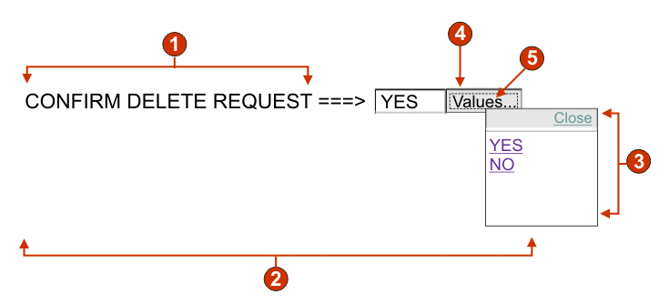
The following figure shows how a popup widget appears on a transformation,
using the data from the Input field with hints component
example as input:
Figure 1. Popup widget example

- Caption (from component)
- Number of columns per row (1)
- Fill (from hints)
- Launcher type (button)
- Launcher caption (Values)
The following settings can be configured for this widget:
- Fill from global variable
- If selected, fill the popup list from the specified global variables.
- Global variable containing list values
- Specifies the name of the indexed global variable containing the set of values. A link for each index in the global variable will be created in the popup window.
- Shared
- ZIETrans local and shared global variables can have the same name. Select this box if you want to use the shared global variable to populate the list items. When this box is cleared, the local global variable is used.
- Global variable containing list captions
- Optional. Specifies the name of the indexed global variable containing the set of captions. The size of the global variable specified by this value should be greater than or equal to the size specified in the preceding setting. The indexes in this indexed global variable should also match up with the indexes in the values global variable (so that the actual value and caption shown to the user are in sync). If this value is not specified, the text for each link will be its value.
- Fill from string
- If selected, fill the popup list from the specified string.
- List items
- Optional. Specifies the string of items to include in the popup
window. Items should be separated with a semicolon
(;). To have the list item caption be different than the list
item value, enter both separated by an equal sign
(=). For example, a value of Apple=A;Grape=G renders a popup window with two items: Apple and Grape. Selecting the first
item causes an A to be inserted in the associated host screen input
field.
If you want both the item in the popup window and the value inserted in the host screen to be the same, you only need to enter the item. For example, Apple=A;G. In this example, a G appears in the popup window and in the host screen input field.
- Fill from hints
- If selected, populate the popup from hints recognized by the component (only applicable when the Input Field with Hints component is used).
- Caption source
- Specifies how the caption for the generated input field is determined.
Options: From component (use
the extracted caption from the component) or Custom (use the specified caption).
- Custom caption
- Optional. Specifies the caption for the input field. Note: Leave this setting blank to not generate a caption for the associated input field.
- Number of columns per row
- The number of input fields to display horizontally before wrapping
to the next line.
Note:
- This setting is not applicable in default rendering.
- The widget preview does not always match the full page preview. This happens because the widget preview simple renders the component's output. It does not try to preserve the alignment of the screen when it renders, as is done in the full page preview.
- Enable cursor positioning option on input fields(Web-only)
- Select this box to allow the user to switch from data input mode to cursor positioning mode for input fields. When in data input mode, the user can enter data into the input field. When in cursor positioning mode, the user can tab to or otherwise position the cursor on any character in the input field. This setting is useful for Web projects that are optimized for mobile devices that do not have other cursor positioning capabilities. For more information about other settings for this option that do not appear in the ZIETrans Toolkit GUI, see Considerations and limitations for mobile devices.
- Read only
- If selected, rendered input fields are read only. A read only input field appears as a regular input field, but does not allow the user to modify its contents. This is useful in cases where you want to display the contents of a non-protected field to a user, but you do not want the user to modify the contents. In the case of the Popup widget, it enables you to control the input supplied into the field. Only values available in the popup can be supplied to the field.
- Enable foreground colors
- If selected, host screen foreground colors are rendered.
For Web applications, colors are mapped to CSS stylesheet classes representing that color. For example, if a host screen field is marked as RED, the Field widget will enclose the generated HTML for that field in a tag whose class name attribute is set to HRED. This allows for you to remap host screen colors on your generated Web page.Note: The blacktheme.css directly maps host screen field foreground colors (for example, red text on the host screen will appear as red text on the generated Web page). However, other stylesheet files like monochrome.css, map field colors differently in an attempt to create a consistent, modern style.
- Enable extended attributes
- If selected, extended field attributes (blink, reverse video,
underline, and column separator) are rendered. Also, for 3270 Web
applications, extended field colors are mapped (see the preceding
setting for more information). See Using style sheets for more
information.
- Blink style (Web-only)
- The CSS style setting you want to use to render blinking text from the host screen.
- Reverse video style (Web-only)
- The CSS style setting you want to use to render reverse video text from the host screen.
- Underline style (Web-only)
- The CSS style setting you want to use to render underlined text from the host screen.
- Column separator style (Web-only)
- The CSS style setting you want to use to render column separators from the host screen.
- Launcher type
- Specifies the style of the launcher. The launcher is used to
open the popup. Options Button, Link, or Image.
- Image filename
- The name of the image file. This is only enabled if launcher type is an Image. Click Import to import an image into your project. A preview window displays the currently selected image.
- Caption
- The caption of the launcher button or link. This is only enabled if launcher type is either Link or Button.
- Link style class (Web-only)
- Optional. The CSS style class associated with the generated launcher link. The value of the class attribute of the HTML link tag will be set to this value. The default value is HATSLINK. See Using style sheets for more information.
- Button style class (Web-only)
- Optional. The CSS style class associated with the generated launcher button. The value of the class attribute of the HTML button tag will be set to this value. The default value is HATSBUTTON. See Using style sheets for more information.
- Close link caption (Web-only)
- The caption to appear for the Close action.
- Input field style class (Web-only)
- Optional. The CSS style class associated with the generated input field. The value of the class attribute of the HTML input tag will be set to this value. The default value is HATSINPUT. See Using style sheets for more information.
- Caption style class (Web-only)
- Optional. The CSS style class associated with the generated input field's caption. The default value is HATSCAPTION. See Using style sheets for more information.
- Table style class (Web-only)
- Optional. The CSS style class associated with the generated table. If more than one set of input fields is rendered, an HTML table will be generated to enclose these input fields. The value of the class attribute of the HTML table tag will be set to this value. The default value is HATSTABLE. See Using style sheets for more information.
- Popup window style class (Web-only)
- Optional. The CSS style class associated with the generated popup window. The default value is HATSPOPUP. See Using style sheets for more information.
- Close link style class (Web-only)
- Optional. The CSS style class associated with the link used to close the popup window. The default value is HATSLINK. See Using style sheets for more information.
- Item link style class (Web-only)
- Optional. The CSS style class associated with the links used to select an item from the popup. The default value is HATSPOPUPITEMLINK. See Using style sheets for more information.
- Style (Web-only)
- Optional.Use the launcher button next to this field to open a style properties dialog. This dialog frees you from the need to understand CSS to change the font, color, or other style settings for the widget. See Using style sheets for more information.
Note: There are times when the popup widget may appear
too translucent. If you want to make the widget more opaque, you must
modify the cascading style sheet (CSS) that your template is using
by doing the following steps:
- Open the CSS your template is using.
- Under the DIV.ZIETransPOPUP class, search for: filter: alpha (opacity=40, style=0)
- Changing the opacity value will adjust the transparency of the popup widget. Where 0 is transparent, and 100 is completely opaque.